Working with Panther
As previously mentioned, the purpose of Panther is to transform your UI component code into a static website that documents and showcases each of your components in isolation. Following the principles of Atomic Design, smaller components are intended to be composed into larger components, which are then placed inside layouts in order to construct pages. Panther doesn’t require you to adopt any particular terminology to describe your component hierarchy, so don’t feel obligated to follow Atomic Design’s biology-based “atoms”, “molecules” and “organisms” abstraction. The high-level concepts that Atomic Design espouses are more important than its naming conventions.
The work that you’ll be doing with Panther will be centred around creating interactive examples of your UI components, then adding them to pages in the static website. Ideally, each component example (which we refer to as a “specimen”) should include documentation outlining its purpose, where and how it should be used, implementation instructions for developers, and links to any relevant outside information. Developers should be able to visit the static website, interact with a component “specimen”, read its documentation and view its underlying HTML.
Directory structure
In order to perform its job, Panther requires you to organize your UI component code in a particular way. The following is a high-level overview of the directory structure that Panther expects your codebase (i.e. the project that you’ve installed the panther-engine NPM package into) to have. The names of the top-level directories are configurable (i.e. patterns, pages, specimen-assets and public), but the names of the subdirectories and the files they contain are not.
patterns
Contains all of the files that make up your UI components. This includes CSS, JavaScript, HTML, fonts, images, etc. The following subdirectories can exist inside:
- configs
- (optional) Shared configuration files. For example, if you want to reuse the same Sass Lint, JSLint or ESLint settings in all of your products, then you can house the configuration files here and import them into each of your codebases.
- fonts
- (required) Web font files, in whatever format(s) your project(s) require.
- images
- (required) Bitmap image files, SVGs and other static, visual assets that are used by your UI components.
- javascripts
- (required) All of the JavaScript modules and classes that power your UI components.
- stylesheets
- (required) All of the CSS that styles your UI components, in SASS format.
- templates
- (required) HTML snippets that demonstrate how to mark up your UI components. These snippets exist in the form of Handlebars templates, which Panther will later compile into HTML.
pages
This is where you’ll go to add pages and navigation links to the static website. This directory must include the following file:
- navigation.yml
- (required) A YAML file that’s used to generate the static website’s navigation menu.
When creating a new page, you can start by duplicating Panther’s prototypes/page directory. Each “page” directory may contain the following files (see Panther’s prototypes/page directory for more information):
- index.hbs
- (required) A Handlebars template, which Panther will transform into an HTML page. Pages typically contain HTML markup interspersed with “specimen” helpers. These special helpers are used to generate interactive
iframes, which showcase UI components on the static website (more on this below). - script.js
- (optional) Allows you to add additional JavaScript functionality to the page. For example, if your page contains a lot of markup, you may want to create expandable/collapsable headings. Or you could decide to create tooltips, sortable data tables, etc.
- style.scss
- (optional) Allows you to add additional CSS to the page. For example, you may want to create colour swatches to visualize your SASS colour variables, and float them side-by-side in a row. Then, at narrow viewport widths, you may want to use a media query to present the swatches in a single, stacked column instead.
- external.yml
- (optional) Allows you to add additional, external JavaScript and CSS files to the page, before and/or after the page’s primary scripts and styles. For example, you may want to include a jQuery UI component on a particular page. In order to achieve this, you would need to pull in the jQuery and jQuery UI JavaScript libraries, as well as the appropriate jQuery UI stylesheets.
After you create a new page, you’ll need to add a link to the website’s navigation menu by editing the navigation.yml file (see above).
specimen-assets
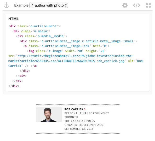
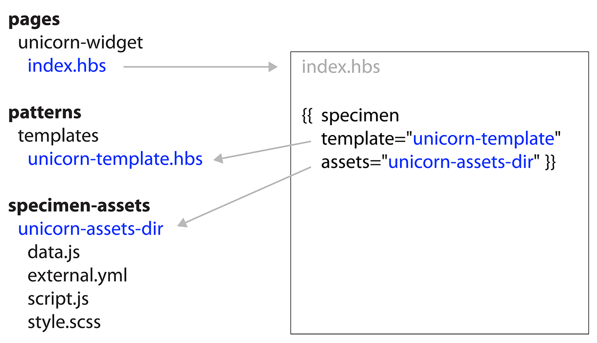
As previously explained, the “specimen” helper is used to generate an interactive iframe, which showcases a UI component on the static website. You must pass this helper a Handlebars template containing the markup that’s associated with your component. You can use the helper’s “block” syntax to supply the template directly, or you can use the template attribute to direct the helper to an .hbs file inside the patterns/templates directory (see Panther’s prototypes/page/index.hbs file for more information).
In addition to referencing a Handlebars template, the “specimen” helper may also reference an “asset bundle” inside the specimen-assets directory. When creating a new asset bundle for your specimen, you can start by duplicating Panther’s prototypes/specimen-asset-bundle directory. Each asset bundle directory may contain the following files:
- data.js
- (optional) When your specimen template contains Handlebars variables, the values of these variables must be supplied to the specimen in the form of a JSON object. When Panther compiles the specimen, it will pass this data into the template to generate the HTML.
- script.js
- (optional) Allows you to add additional JavaScript to the specimen page. This code is meant to demonstrate how to initialize your component. For example, if your component includes one or more JavaScript classes, then the code in this file should demonstrate how to create instances of those classes, call their methods, etc. The JavaScript in this file will appear inside the specimen’s code panel, and is intended for developers to copy and paste into their projects, so that they can get up and running as quickly as possible. This file should never contain a component’s actual JavaScript, only auxiliary JavaScript that demonstrates how to initialize the component. All component-related JavaScript should live inside the
patterns/javascriptsdirectory. - style.scss
- (required) Documents all of the SASS files that will need to be imported into a given project in order to make the component appear and function properly. Omitting this file will result in no CSS being applied to the specimen.
- external.yml
- (optional) Allows you to add additional, external JavaScript and CSS files to the specimen page, before and/or after the page’s primary scripts and styles. For example, your component may rely on a script or stylesheet that’s hosted on a third-party CDN.
public
Contains the generated static website files. The contents of this directory can be deployed to a web server, but should not be committed. It’s recommended to add this directory to your .gitignore file.
The “specimen” helper
A “specimen” is defined using a custom Handlebars helper, inside of a page template (i.e. pages/unicorn-widget/index.hbs). When Panther generates the static website, each specimen will be transformed into an interactive iframe, which will showcase a particular UI component. Refer to the code comments in Panther’s prototypes/page/index.hbs file for more detailed instructions on how to use the specimen helper.
The following attributes are available to the “specimen” helper:
- assets
- (optional) Specimen asset directory name, relative to the
/specimen-assets/ directory(see above). - template
- (optional) Handlebars template file name, relative to the
/patterns/templates/directory (see above). - initialWidth
- (optional) Default iframe width.
- fixedHeight
- (optional) Fixed iframe height (user will not be able to adjust the iframe’s height).
- hideHTML
- (optional) Don’t display specimen HTML in the code panel.
- hideCSS
- (optional) Don’t display specimen CSS in the code panel.
- hideJS
- (optional) Don’t display specimen JavaScript in the code panel.
- additionalJSFiles
- (optional) A comma-separated list of additional JavaScript files to display in the code panel. Files must be relative to the specimen’s own directory (i.e.
/specimen-assets/[specimen-name]/). None of these files will display ifhideJSistrue. - noResize
- (optional) Disable iframe via drag handles, so that user will be unable to resize the iframe.
- seamless
- (optional) Hides the entire control bar.
- centered
- (optional) Centers the specimen within its iframe.
- backdrop
- (optional) Allows you to specify a default backdrop colour from the
config.themeColorshash map (see the Configuring Panther page). - padding
- (optional) Sets the specimen iframe’s default padding.
- hideSettings
- (optional) Hides the settings panel and gear button.
Specimen file and directory structure
The following is a visual aid to help you better understand how the “specimen” helper works:
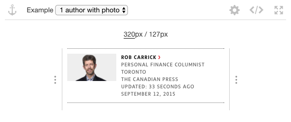
How specimens appear on the static website
Specimen with collapsed code panel
Specimen with expanded code panel